One of the things on my to-do list this year before heading back into wedding season was to do a massive print test across a multitude of labs to make sure that a) I’m using the best pro lab for my vision and my clients and b) that when I refer a consumer lab to clients I’m referring them to the one that I truly can stand behind. I originally wanted to post my consumer print lab comparisons first but one lab is taking FOREVER to deliver prints (almost a week so far!) and all of my pro lab results are in. Without further ado, here are the professional lab results!
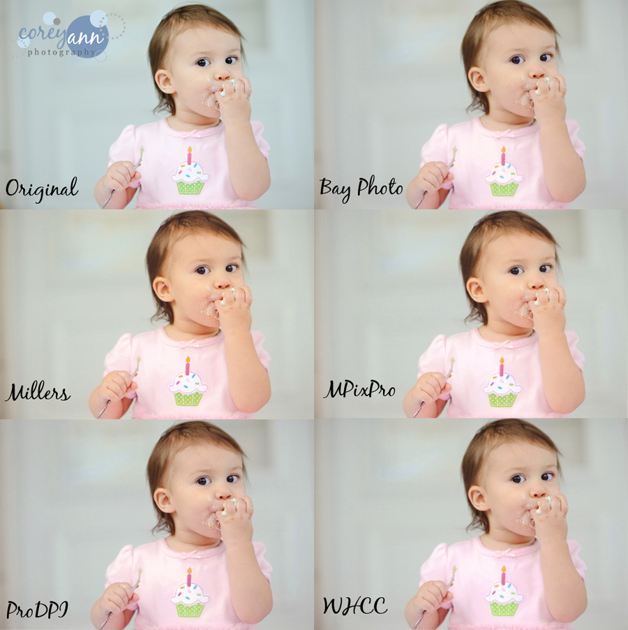
In comparing the labs I sent out a selection of 15 prints of various types of sessions and lighting conditions. I’m only showing one print from the lot but I used all 15 to base my comparisons on. The print I’m showing you for comparison in my opinion hit upon many of the things that I’m looking for when evaluating a print and felt this was a good representation of things that could go wrong in one print. Keep in mind that while I calibrated my scanner to the best of its abilities, the real life comparisons are MUCH more accurate than any scan. However each scan was done with the same settings with the same scanner and while the results may be a tinge more pronounced, I did compare each file to its scanned copy and none are vastly different from the prints. Also, please don’t note the cropping on these comparisons as scanning to a millimeter perfection is nearly impossible.
For comparisons for consumer labs, go here. Also note that for the best possible results when you hone in on your favorite lab: download and utilize their ICC profiles to make sure it’s the best print possible for your clients.

In depth reviews of each printer
Here’s some insight into the lingo. Exposure = the light/dark of the image. Color = matching the colors as are true to my original image. This includes color casts (more of one color vs another) as well as saturation (how bright a color is). Shadows = amount of detail in the darker parts of the picture. If they are clipped, this means that you lose detail in the darker parts of the images which is often dark eyes and hair. Cropping = are the images cut how they were uploaded, is the whole image there or are parts missing. Sharpness = how in focus the picture is vs. how it was originally.
Bay Photo
Results:
• Exposure: Pretty close to being spot on.
• Color: Slightly red.
• Shadows: Slight clipping.
• Cropping: Crop is correct.
• Sharpness: Images are as sharp as the original file.
• Overall feeling: I have not used Bay Photo before but have heard good things. When I talked online about doing this test, many photographers urged me to use them. They were a very close runner up to being the top choice. Their delivery took about 3 days which is decent and the range of products is good. I would recommend them!
Millers
Results:
• Exposure: Slightly underexposed.
• Color: Red cast, oversaturated.
• Shadows: Clipping.
• Cropping: Crop is correct.
• Sharpness: Images are as sharp as the original file.
• Overall feeling: Millers is generally known as the cadillac of labs with professional photographers and I have to confess – I was a bit let down with them. Their delivery time is amazing (often next day!) but the cost of their products definitely has that service built into it. While these prints are still a far cry better than 95% of the consumer labs, I still was a bit bummed.
MPixPro
Results:
• Exposure: Slightly underexposed.
• Color: Slight red cast, slight oversaturation.
• Shadows: Slight clipping.
• Cropping: Crop is correct.
• Sharpness: Images are as sharp as the original file.
• Overall feeling: I got these prints the same day as Millers and I have to say, I was actually more impressed with the prints from MPixPro than from Millers, which is kind of weird because MPixPro is a step down from the Millers lab (they are in the same family). In person the differences are less noticeable and before I received the final sets of prints, this was my top contender for the “winner” of this contest.
ProDPI
Results:
• Exposure: Very slightly overexposed.
• Color: Slight red cast, slight oversaturation.
• Shadows: No clipping.
• Cropping: Crop is correct.
• Sharpness: Images are as sharp as the original file.
• Overall feeling: This is my lab of choice and I was on pins and needles waiting for these results. I was SO happy when I got them (with the requisite candy in the box!) and saw that they were exactly what I was hoping for. Their CS has always been top notch and I’ve always been impressed with their products. While the image is slightly warmer, it still reflects my vision for my images and it is hands down my favorite of all the pro labs!
WHCC
Results:
• Exposure: Slightly overexposed.
• Color: Slight red cast, slight desaturation of colors *more noticeable in person
• Shadows: No clipping.
• Cropping: Crop is correct.
• Sharpness: Images are as sharp as the original file.
• Overall feeling: Prior to switching to ProDPI I used WHCC because I really liked their products and prints. After WPPI in 2009 however, I switched to ProDPI after WHCC had some questionable marketing endeavors that I didn’t quite agree with. I did want to include them though because if they ended up being the best, I wanted to make sure my clients were getting the best, despite my misgivings. While the scan shows that this print isn’t terribly different than ProDPI in person it’s a bit of a different story. The colors are a bit muted and the ProDPI print pops a lot more on the paper. However, I do like the Tootsie Roll Pop that came in the box! It’s not enough though to woo me back.
So…. there you have it!! If you are local to me and would like to see these suckers in person, feel free to drop me a line. If you aren’t local and want to have the high resolution files to pick over yourself, let me know! Got any other ideas? Comment away!
Stay tuned for the comparison of the consumer labs in the coming days!

12 responses to “Corey Talks | Print Comparisons (Pro)”
Did you use printer color profiles for each lab? Do you use a color profile when you work with a lab? For example, while working with Pictage, I use their printer profile, which is very different than the built in profile on my mac.
[…] (Consumer) Published by Corey Ann on April 27, 2012. Filed under Corey Talks I posted the other day my results from my print off from professional photography labs, today I’m going to blog about the results of the same test from consumer […]
This pretty much mirrors my results from pro labs too. ProDPI just has a superior product 🙂
I use Burell Imaging and they are amazing! Thanks for the comparison. Very helpful.
thank you for sharing this! I am in the throws of signing up for self fullfillment on line. Signed up last night for Zenfolio 14 day trial and woke up this morning thinking Huh? should try the lab first before doing all the work to change web site directing it to a lab I do not know!
This is the first on line comp I have seen. Looking for more recent ones if you know of any. thanks!
Linda
Very helpful! Thank you for sharing. Have you ever used Simply Color?
awesome thank you….you saved me having to order from all to see : ).
I just love ProDPI and have never been let down by anything that I have received from them. I too have noticed the slight red cast and tend to try and adjust a bit for that in post. I have recently been thinking of doing such a comparison to see if maybe I should be using another service. I now feel that would all be a waste of time. Have you ever ordered albums from any other services? That is my only other question remaining, as I know there are a lot of great albums out there. So glad I choose the right printer to begin with!! Keep the great content flowing!!
Thanks for the write up. I’ve been a Millers user for the last two years and just found ProDPI. One thing I’ve noticed is the graphic designer I buy templates from creates the templates for Miller’s products. Do you buy from someone who does them for ProDPI?
Did you ever do a consumer print lab comparison?
These are a far sight better than the consumer version for detail (her hair isn’t a black blob), but I’d be a little twerked if I sent a photo with a blue cast off to a pro/$$$ company and it came back warmed up. I guess the question is: Do these pro labs use computers only, meaning you could make a correction – editing or monitor settings – based on what you get back and send it through again knowing that you should get the proper colors back in the future, or is there a person looking at these and deciding to adjust it based on what they think the proper color/exposure/whatever should be? If the latter, I think it would be worth investing in a pro-grade printer and really doing one’s own printing.
Very useful info, saves me from this project!:) I usually use Millers but wanted to compare them with Bay and ProDPI.